100 YEAR CELEBRATION STICKER
CAMP LA VERNE
Collaboration, Ideas, and Design
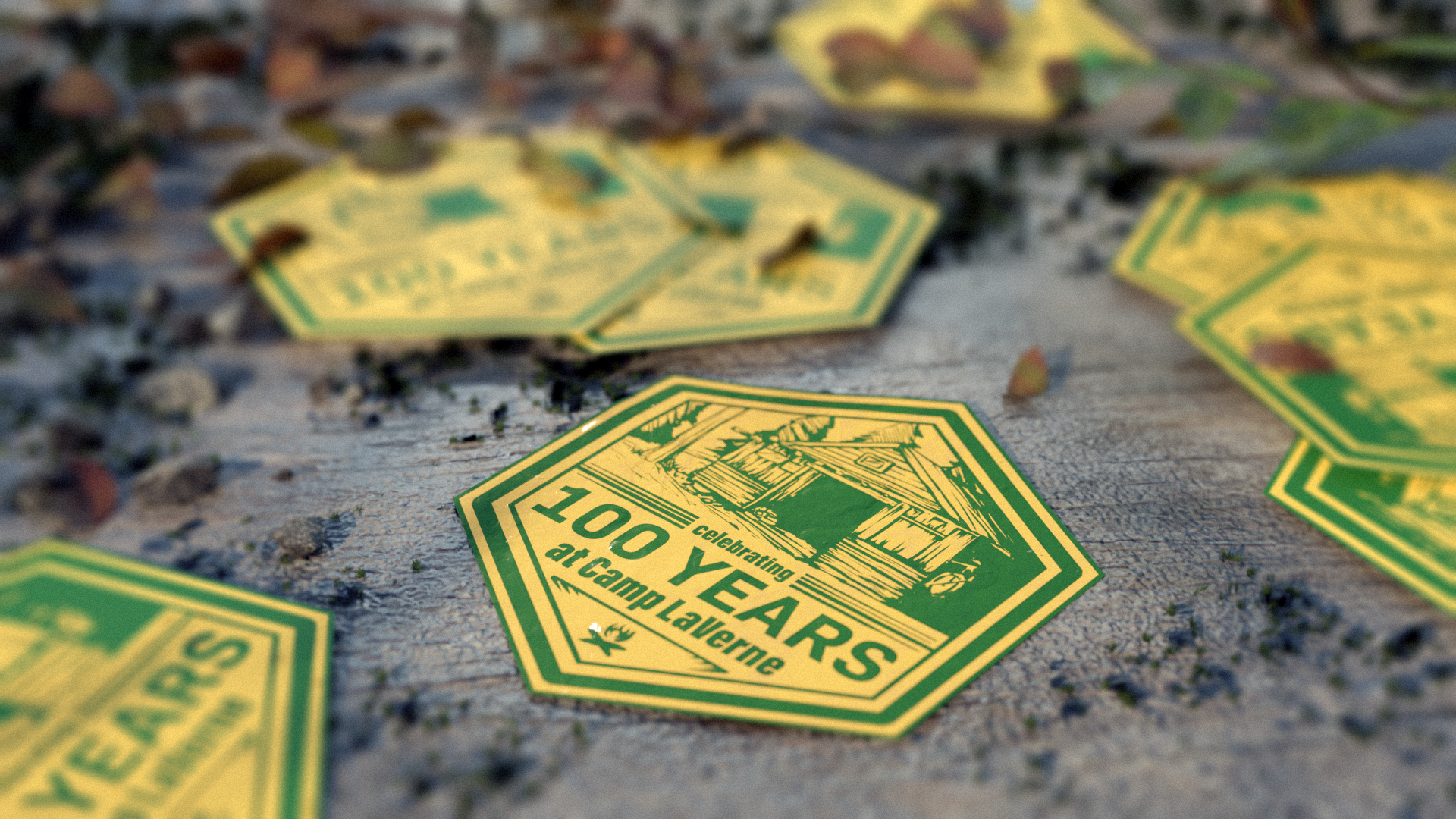
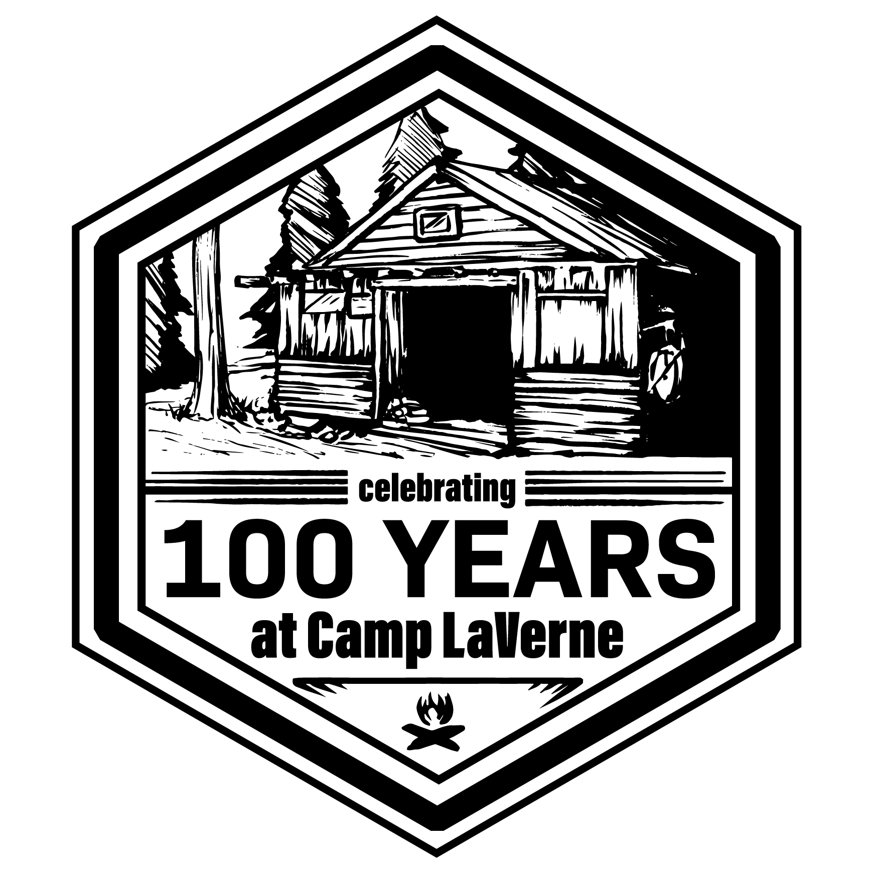
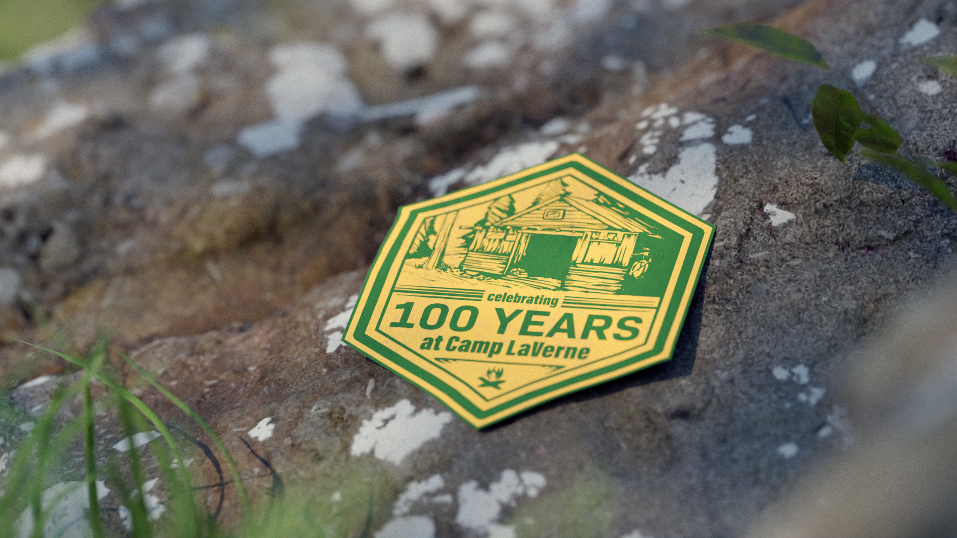
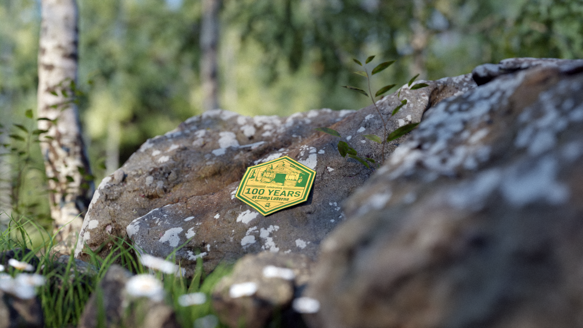
Working with the kind people of the Publicity Committee of Camp LaVerne, I designed a sticker to commemorate the 100th Anniversary of the opening of the Camp. The design that we ended up with perfectly encapsulates life at Camp LaVerne, rustic and connected to nature.
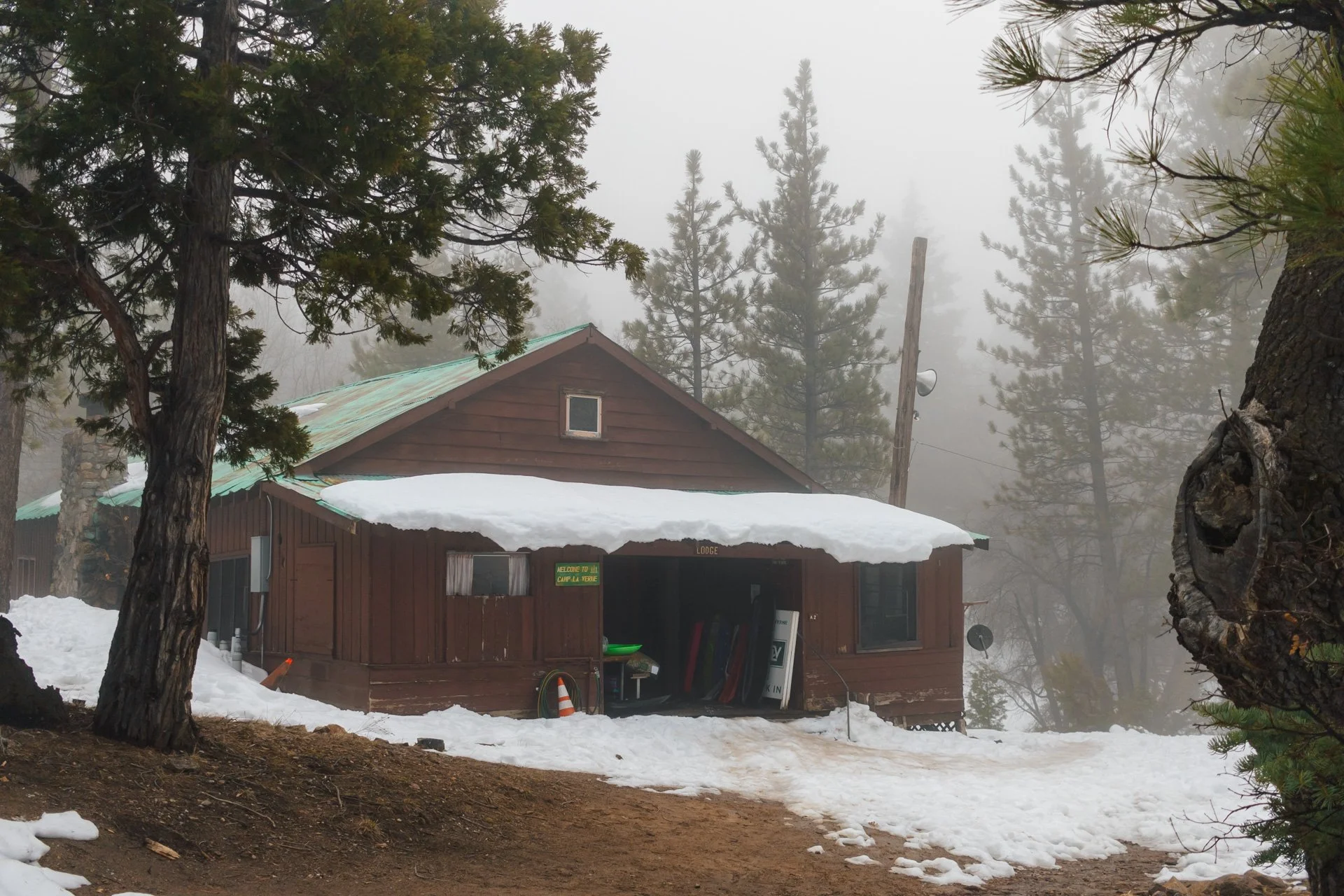
The subject depicted on the sticker, the Lodge of the Camp stands as the heart of the camp, serving as the meeting place for meals, activities, and welcoming new campers.
Visual Development
The Lodge is a Long rectangular building, surrounded by the beautiful forest of the San Bernardino Mountains. The building serves as the main meeting place for campers and counselors, as well as the kitchen, and where all members of the camp share meals.
For all of these reasons, the Lodge building was chosen as the main subject to be depicted on the sticker design.
Final Design
The shape of the sticker was chosen due to market research showing a pattern of incorporating a hexagonal shape to encapsulate the subject matter of more “outdoorsy” runs of stickers. The hexagonal shape also perfectly compliments the pointed roof of the Lodge, as well as mimics the slanted lines of the trees in the background.
Colors
The Lodge
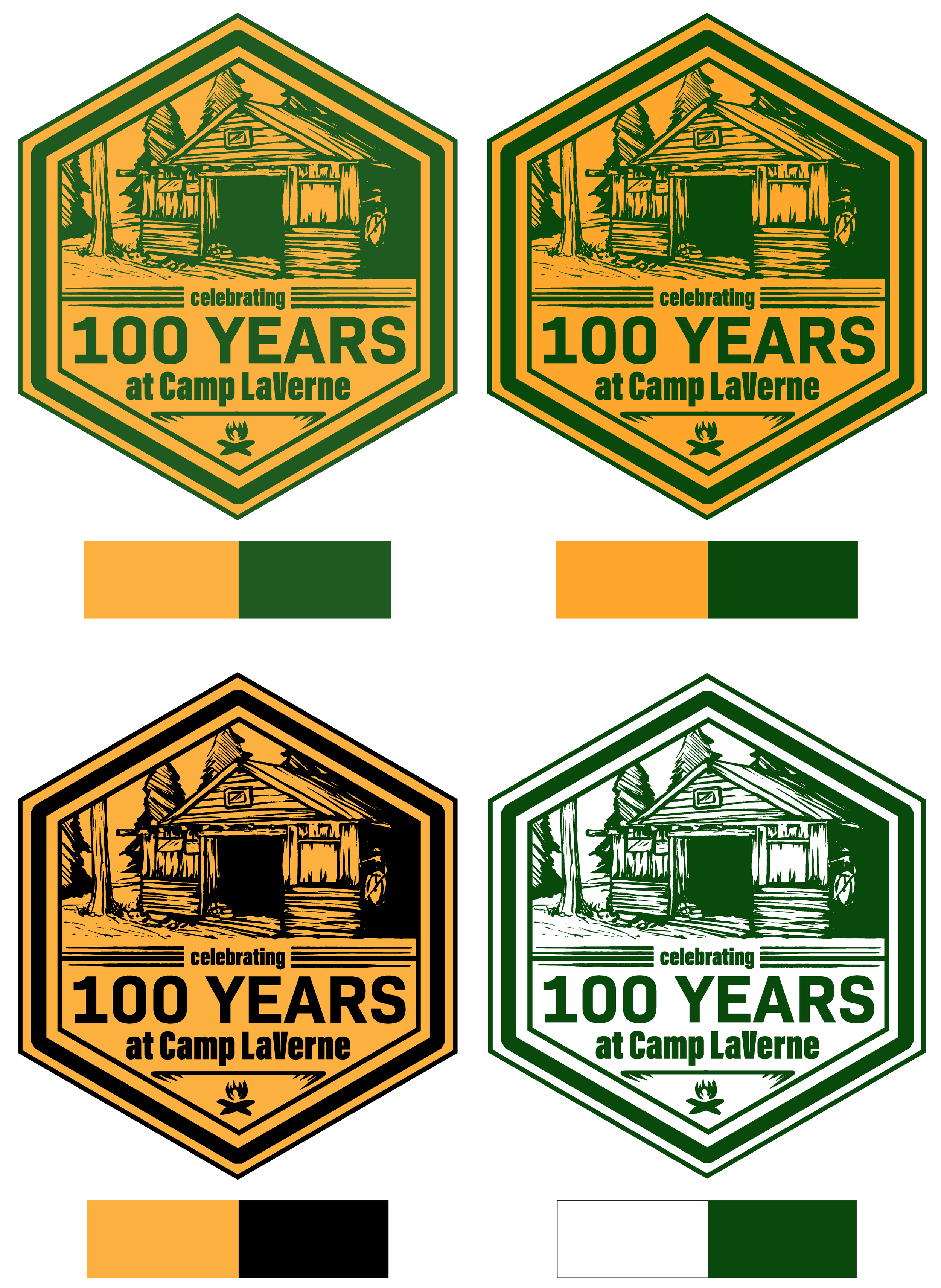
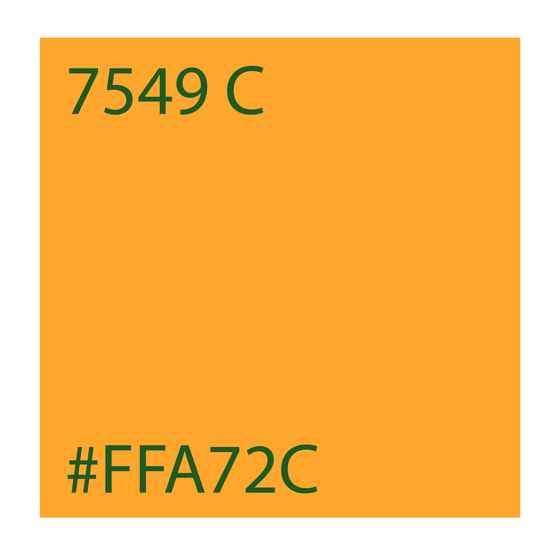
The camp has a long running brand identity using green and yellow as their primary color scheme. This has carried over through previous camp sessions, as seen in this sticker design from the 2020 Camp LaVerne Virtual Camp.


